Mobile Banking App Dashboard Redesign
Project Info
Newcastle Permanent (NGM Group) was exploring ways to update their mobile app dashboard to accommodate new features and offerings. The challenge was to evolve the design without compromising the existing experience, which was already well regarded by customers.
I led the UI design and prototyping, contributed to co-design workshops and testing sessions, and helped shape two validated dashboard concepts informed by behavioural research and user feedback.
At a Glance
Challenge: Evolve the mobile banking dashboard to support new features without disrupting an experience customers already understood and trusted.
Evidence: Four dashboard directions were explored and tested with 22 participants, followed by a focused validation round with 13 participants.
Outcome: Classic was recommended as the lowest-disruption first release, with Wallet and Pages retained as future-state directions.
Approach
We combined design sprints, lean UX and ethnography-style testing by mapping current journeys, facilitating feature workshops, prototyping four editions, and testing them with 22 participants across varied user groups.
Design Directions & Refinement
Building on early research and stakeholder input, we explored four distinct dashboard prototypes, each trialling a different balance of familiarity, discovery, and control:
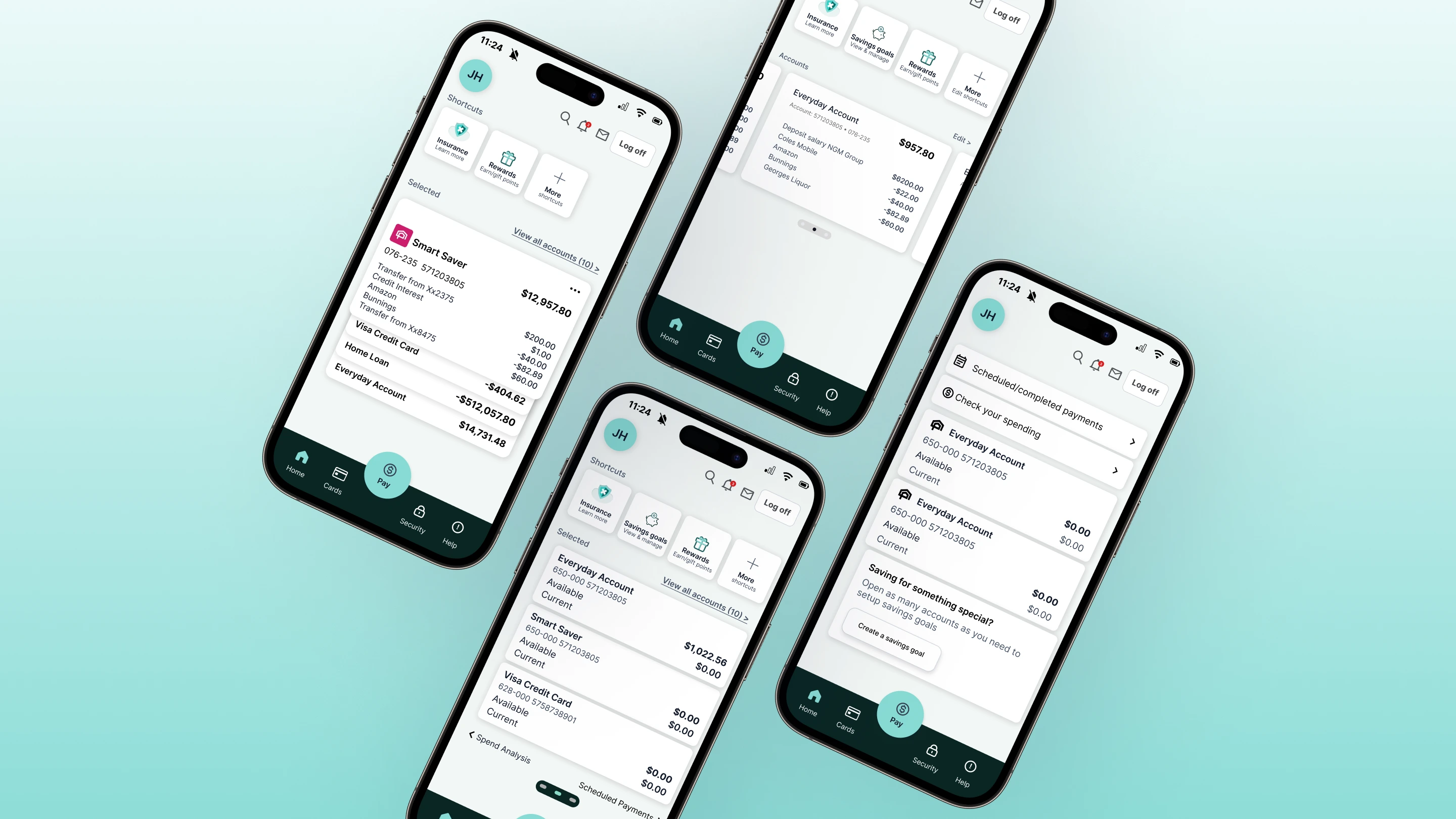
Classic Edition: A familiar layout for minimal disruption. It reflected the live version with subtle enhancements, including a Profile entry point, adjusted dock actions, and highlighted Spend Analysis, making it a strong candidate for early rollout.
Wallet Edition: Layered structure with quick actions and multi-account visibility for more experienced users.
Pages Edition: Guided, swipe-based navigation through key tasks, improving clarity and sequence.
Horizontal Scroll: Explored but deprioritised after testing showed it didn’t scale well for customers with many accounts.
Refinements emerged through co-design and usability testing. Labels, spacing, gestures, and hierarchy were tuned to what felt most intuitive, building a more grounded, future-ready experience.
Final Screens by Edition
Below are the final states of the Classic, Wallet and Pages editions, with Horizontal Scroll retained for reference as a deprioritised concept.


Pre-Login Enhancements
We simplified the pre-login screen. Product tiles were reduced from rectangles to smaller, tappable circles for faster scanning and pattern consistency. We also introduced “Add another account” to support multi-account balance visibility.

Design Thinking to Delivery
Early behavioural insights shaped the four edition concepts, which we iterated through co-design, prototyping, and 22-participant studies. We packaged the validated directions for build: annotated flows, motion guidance, and UI tokens (colour, spacing, typography), with a phased rollout plan. Classic launched first, then evolved with Wallet and Pages. This created continuity from discovery to delivery and a pragmatic pathway to ship improvements with minimal disruption.
Key Design Opportunities
From early discussions, stakeholders highlighted features that would increase control, safety, and day-to-day value. These became focal points for testing and iteration:
Spend Analysis: visual understanding of spending to build control.
Savings Goals: planning and progress feedback to encourage better habits.
Security & Scam Reporting: clearer routes to urgent action.
Search: support for lesser-used or infrequent tasks.
Rewards: value-add surfaced via shortcuts; tested for placement and tone.
What We Learned from Testing
Across 22 participants with diverse banking needs, we prioritised clarity, confidence, and frictionless access to common tasks (balances, scam reporting, payments, overseas travel notices). Classic performed strongly for familiarity; Wallet and Pages resonated for layered clarity and flow; Horizontal Scroll was deprioritised due to navigation overhead.
Outcome & Next Steps
Classic Edition emerged as the logical first rollout, upgrading the experience without disruption. Wallet and Pages offer credible paths for future iterations, aligning with behavioural insights and rising expectations.
Key Findings from Testing
A second round of focused usability testing was conducted with 13 participants to validate preferences and refine key interactions.
Spend Analysis
- · 10 of 13 participants found it helpful after checking accounts first.
- · Useful for reflecting on spending habits.
Swiping Between Pages
- · 10 of 13 liked swiping for navigation.
- · 3 initially found it confusing due to current app patterns.
Shortcuts
- · 12 of 13 liked shortcuts, even among Pages-edition fans.
- · Requests for customisation or “most used” surfaced often.
Where Users Expect Key Actions
- · 12 of 13 placed “Change Password” under Security.
- · 10 of 13 placed “Change Address” under Profile.
- · 8 of 13 placed “Notify Overseas Travel” under Security; others used Search or Help.
“Swiping is very natural. Easy to explore.”
“Swipe helps to put emphasis: go this way to do this.”
“Shortcuts are brilliant. I get to what I need without clicking around.”
Edition Preferences
Pages Edition
- · Preferred by 8 of 13 participants.
- · Appreciated for clarity and the swiping navigation once discovered.
Wallet Edition
- · Preferred by 5 of 13 participants.
- · Initially overwhelming but later seen as powerful and rich in features.
Classic Edition
- · Mentioned by 3 participants as second choice.
- · Favoured as a stable launch version due to minimal changes.
Hybrid Suggestions
- · 4 participants suggested combining Pages navigation with Wallet-style shortcuts.
Key Takeaways
Patterns that shaped the recommendations: prioritise quick access to balances and core tasks, keep language natural, and make hierarchy legible at a glance.
- · Start on Accounts; it reflects the most common intent.
- · Wallet view bridges old and new patterns with layered familiarity.
- · Differentiate stacked cards to aid scanning and recognition.
- · Show current and available balances for clarity and confidence.
- · Pre-fill shortcuts with common or recent actions to reduce friction.
Project Deliverables
Two test-ready prototypes and a behavioural design foundation aligned to team goals.
- · Finalised Wallet + Pages prototypes for phased rollout.
- · Behavioural design principles for future features.
- · Future-state navigation and clarity guidelines.
Reflections
The most valuable banking app isn’t necessarily the most complex. It’s the one that knows what matters most to its users and shows that first. Calmness, not complexity, became the measure of success.
