Digital Transformation of Operational Workflows
Project Info
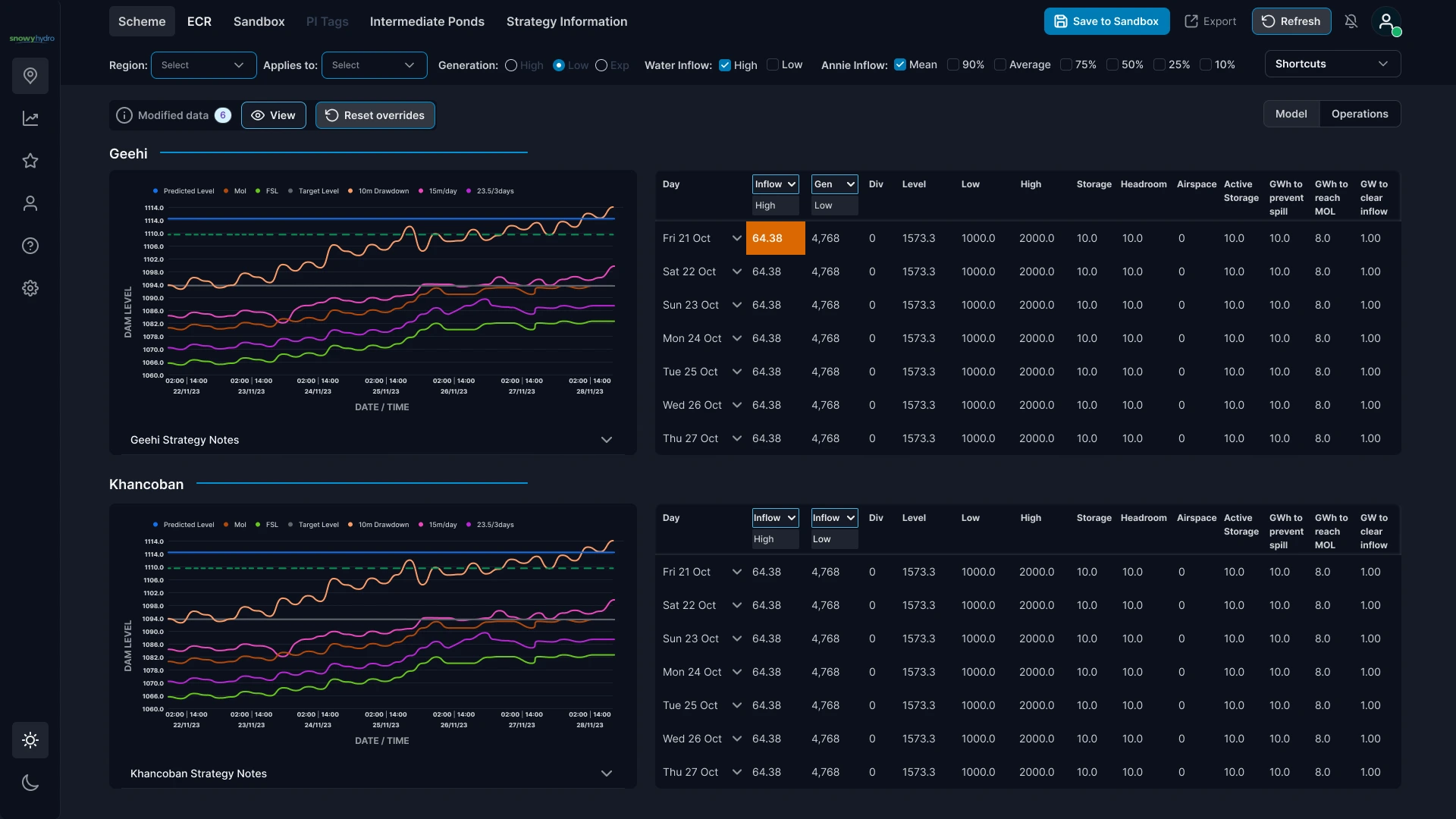
The Trading & Operations teams at Snowy Hydro were relying on ageing Excel-based tools that were slow, fragile, and isolated. Forecasting required manual reconciliation across teams and made collaboration difficult. Through focus group sessions, we identified the need to replace these legacy workflows with a collaborative, real-time digital environment, leading to the creation of the Scheme Model Dashboard Interface, designed to centralise forecasting and streamline day-to-day operational planning.
As UI Lead and UX Designer, I established the digital design framework from the ground up, setting up all visual assets and screen templates, creating a scalable design system for future development, and building interactive prototypes in Figma to test layout efficiency, theme variations, and visual hierarchy. The process required close collaboration with multiple teams to translate complex, spreadsheet-based workflows into a unified, intuitive digital interface.
At a Glance
Challenge: Replace fragile Excel-based operational workflows with a clearer, collaborative dashboard for forecasting and day-to-day planning.
Approach: Translate complex operational requirements into a scalable dashboard interface, supported by reusable UI foundations, structured layouts and light and dark modes for shift-based teams.
Outcome: A centralised Scheme Model Dashboard interface that made dense operational data easier to read, compare and act on across teams.
Collaborative Design Environment
To support cross-team collaboration, I designed a sandbox environment that allowed team members to manipulate and test data inputs in real time. This shared space enabled users to adjust and experiment with variables, encouraging clearer visibility of potential outcomes and fostering more informed decisions around inflow and forecasting adjustments.
UI Foundations – Grid & Spacing
The layout system is built on a 12-column grid with an 8px baseline, ensuring consistent alignment and readable rhythm across dense data views. Spacing follows a rem-based scale mapped to the 8px step, which keeps components visually balanced and prevents anti-aliasing on high-density displays.
Containers, gutters and in-component padding follow the same step system to preserve hierarchy at every level. This creates a predictable structure that scales, whether displaying summary cards or complex tables.

UI Foundations – Typography
The typographic system was scaled with responsiveness in mind, focusing primarily on dashboards designed for larger screens (1920 × 1080). Since the team was already using Inter across other digital products, it was retained to maintain visual consistency and avoid introducing unnecessary complexity.
While the design foundations were optimised for desktop environments, scalable typography tokens and modular layouts were established to support future adaptability across tablet and mobile, ensuring flexibility without extending the initial project scope.

UI Foundations – Colour Palette
The colour tokens were named using Tailwind CSS conventions, as requested by the development team. This approach aligned well with my workflow and experience in front-end design systems, ensuring seamless handoff and consistency between design and code.
Although not required for this phase, I also defined error, warning and success states to future-proof the palette and provide a complete foundation for subsequent iterations.

UI Elements – Interactives & Iconography
I implemented a concise icon set focused solely on essential functions to maintain clarity and visual simplicity. The system was designed to evolve with future phases, allowing new icons to be introduced as the interface expands. Interactive components follow consistent padding ratios (horizontal × vertical = 2:1) and align to the 8px baseline grid for visual balance.
As the Scheme Model Dashboard is a data-driven environment rather than a traditional application, there was no need for extensive UI components such as input fields or complex button variants. The interface employs a restrained set of button styles, limited to core states and hierarchies, to keep interactions straightforward and consistent.

Design Outcome
The final interface consolidates complex operational data into a clear, legible system, delivered in light and dark modes and supporting faster, more confident decision-making in day-to-day operations.


