myBega Ordering Experience
Project Info
myBega is Bega Group's B2B ordering portal, used by business customers across food service, retail, health, aged care and corporate environments. The project focused on increasing average order value by improving how customers find products, repeat orders, discover relevant offers and move between known items, alternatives and complementary products.
Customer research, sales team insight, feature research, prototyping and testing showed that many customers were using the portal in a narrow re-ordering pattern. They relied heavily on favourites, standing orders and familiar products, which meant the wider catalogue, promotions and substitution pathways were often missed.
At a Glance
Challenge: Help customers discover more of the catalogue, notice relevant promotions and consider complementary or alternative products without slowing down practical B2B ordering tasks.
Evidence: Customer research, sales team insight, feature research, prototyping and usability testing showed that many customers stayed within narrow repeat-ordering patterns.
Outcome: Prototype testing indicated improvements across key tasks, including +17% overall clarity and efficiency, +27% homepage discovery, +23% product details and +19% all-products browsing.
Approach
The work combined customer research, sales team interviews, feature research, prototyping and usability testing. Workshops helped establish the commercial priorities early, while sales team interviews brought in field-based context from people regularly speaking with business owners and staff.
From there, the project moved from behavioural insight into practical experience changes across catalogue browsing, promotions, recommendations, alternatives and cart interactions.
Research Inputs
Customer sessions included café and restaurant, retail and convenience, health and aged care, and corporate environments. Each group had different purchasing drivers, but the shared need was clear: ordering needed to feel fast, relevant and dependable.
Smaller businesses were generally more responsive to price and promotions, while larger customers placed more weight on quality, reliability and procurement confidence. Desktop and laptop were the dominant ordering environments, with mobile used mainly for urgent or on-the-go tasks.

- · 5 remote customer sessions, each approximately 45 minutes.
- · Participants represented café, retail, health, aged care and corporate ordering contexts.
- · Screener responses helped identify participants with existing FMCG B2B ordering experience.
- · Sales team interviews added field-based insight into customer objections, ordering habits and opportunities to improve purchasing behaviour.
Key Findings
The research showed that the commercial opportunity was closely tied to everyday ordering behaviour. Customers were using the portal to complete familiar tasks quickly, but the experience was not giving them enough reason or confidence to explore beyond what they already knew.
- · Product selection needed to feel faster, clearer and less repetitive.
- · Promotions needed to be more visible and more relevant.
- · Quantity types and variants needed to be easier to compare.
- · Out-of-stock moments needed to guide users toward suitable alternatives.
- · Discovery needed to be introduced in ways that supported, rather than interrupted, the ordering task.
“There are too many options for the same product. If I just want milk, I have to scroll through multiple sizes and packs.”
“If something is out of stock, I have to find an alternative myself or just go elsewhere.”
“I ignore emails, but if there's a banner in the portal, I'll notice it.”
Ordering Friction
Many customers entered the portal with a fixed task: reorder known products, check pricing, confirm availability and move quickly to checkout. That behaviour limited discovery. When customers were not browsing, comparing or seeing relevant alternatives, the portal had fewer opportunities to influence basket size.

- · Similar products appeared as separate tiles when quantity types or variants differed.
- · Filtering consumed valuable screen space and made browsing feel more cumbersome.
- · Promotions were not visible enough at the point of decision.
- · Error handling and cart corrections created unnecessary hesitation.
Experience Changes
The proposed changes were organised around two connected priorities: improve the core ordering journey first, then introduce clearer moments for product discovery.
Improve the ordering foundation. The first set of changes focused on making products easier to find, compare and add to cart before adding more promotional or recommendation-led patterns.
- · Product imagery was brought forward to make catalogue scanning easier.
- · Quantity-based SKU duplication was reduced so customers could choose quantity type within a cleaner product tile structure.
- · Layout changes increased the number of visible products and reduced wasted browsing space.
- · Cart corrections were simplified so customers could adjust quantity type after adding a product.
Introduce clearer discovery moments. Once the ordering basics were clearer, the experience could surface relevant products, offers and alternatives at points where they supported the customer's task.
- · Promotions were made more visible within the browsing and ordering flow.
- · Recommendation modules created clearer paths to related and complementary products.
- · Marketing activity was translated into product modules and campaign-led entry points customers could act on.
- · Favourites became a stronger entry point for relevant offers, alternatives and additional varieties.


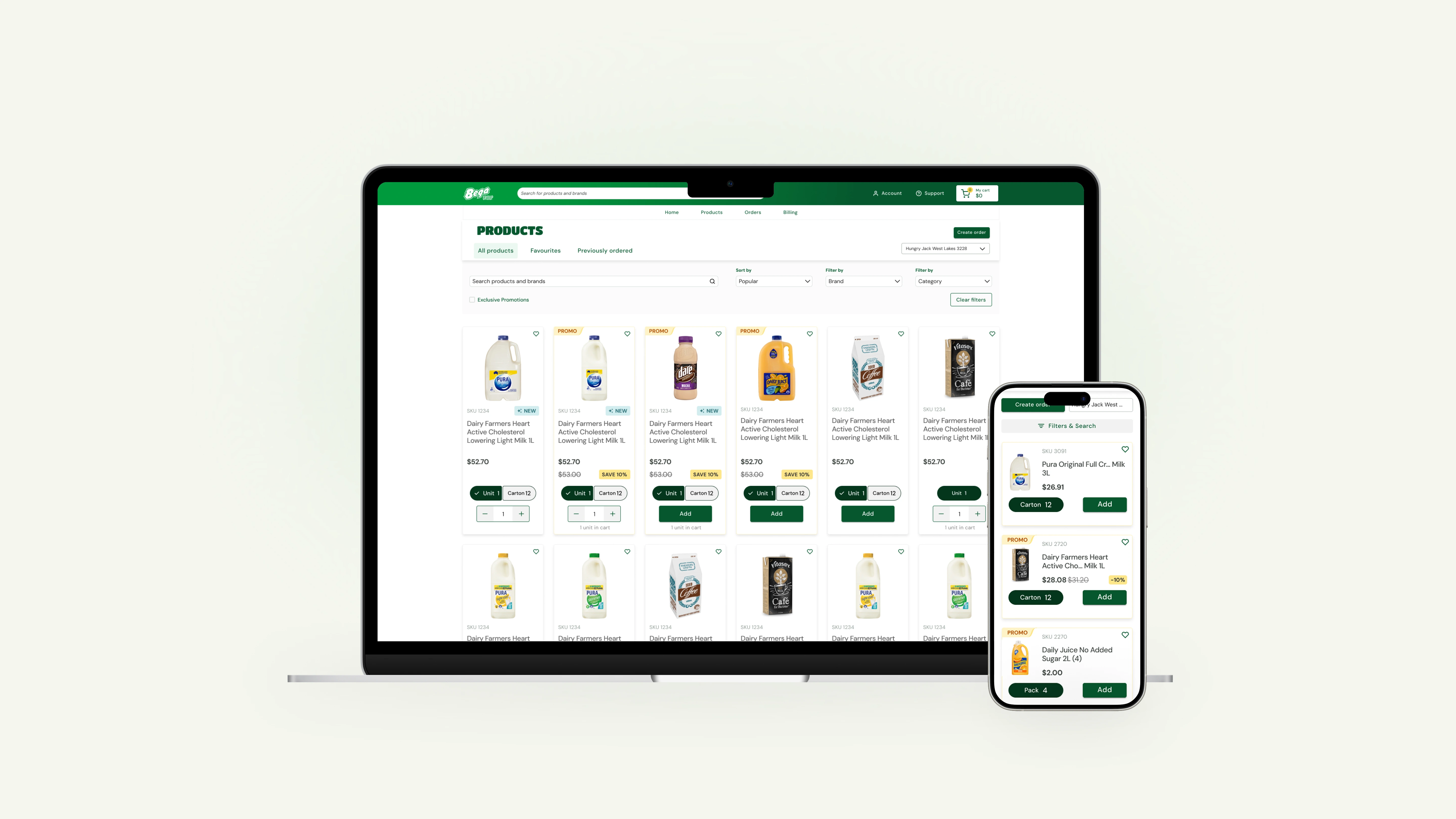
Product Card Refinement
The product card became the key building block for the catalogue experience. It needed to support product recognition, comparison, promotion visibility, quantity selection and add-to-cart confidence.

- · Larger product imagery made products easier to recognise while scanning.
- · Promotion and savings information was positioned closer to the purchase decision.
- · Consolidated quantity types reduced repeated tiles and selection risk.
- · Unit confirmation gave customers clearer feedback before checkout.
Discovery Patterns
The homepage was not the primary ordering destination for customers. During testing, time-poor users often skimmed past it and moved quickly into familiar ordering paths such as favourites, standing orders or known product searches.
The opportunity was to make the homepage work harder without turning it into another barrier. By surfacing relevant promotions, campaign-led products, repeat-order shortcuts and category entry points, the experience could give customers a reason to browse before moving into the order flow.
- · Featured promotions
- · Additional varieties
- · Curated collections
- · Category bestsellers
- · New product inserts
- · Customers similar to you also bought
- · Suitable alternatives when products were unavailable
Testing & Refinement
Prototype testing compared the current experience with the proposed direction across four key tasks: all products, product details, cart and checkout, and homepage discovery. Participants rated each version for clarity and efficiency.
Overall clarity and efficiency
Homepage discovery task
Product details task
All products task
The proposed direction indicated improved clarity and efficiency across the tested tasks, with the strongest gains appearing in homepage discovery, product details and all-products browsing. This supported the direction of making discovery more visible while keeping the core ordering task efficient.
Given the small test sample, the results were treated as directional rather than final performance metrics. They helped validate that the proposed changes were easier to understand, more useful to navigate and moving in the right direction.
Direction & Next Steps
The work shifted myBega from a purely transactional ordering portal toward a more useful product discovery and growth channel.
By improving the foundations of the ordering experience, then layering in relevant discovery, promotion and recommendation patterns, the proposed direction created a clearer path to increase average order value while respecting how business customers actually order: quickly, repeatedly and with a strong need for confidence.
- · Foundational improvements focused on product tiles, cart tiles, search, filtering and responsive behaviour.
- · Discovery improvements focused on new product inserts, promotions, recommendations, additional varieties and curated collections.
- · Longer-term opportunities included analytics foundations, experiment planning and more data-informed optimisation.
Key Takeaways
The strongest commercial opportunities were closely linked to usability. Customers needed the basics to feel clear before they could confidently explore more of the catalogue.
- · Improving product selection and quantity behaviour created a stronger foundation for discovery.
- · Promotions needed to appear inside the ordering context, not only through emails or manual searches.
- · Recommendations needed to feel timely, relevant and easy to ignore when not needed.
- · Data and analytics could help the portal move from reactive ordering to more targeted optimisation.
Reflections
This project reinforced that growth-focused design starts with behaviour. Customers cannot be expected to explore more if the experience does not first make ordering feel clear, reliable and worth their time.
