Building a design system generator for Figma
Project Info
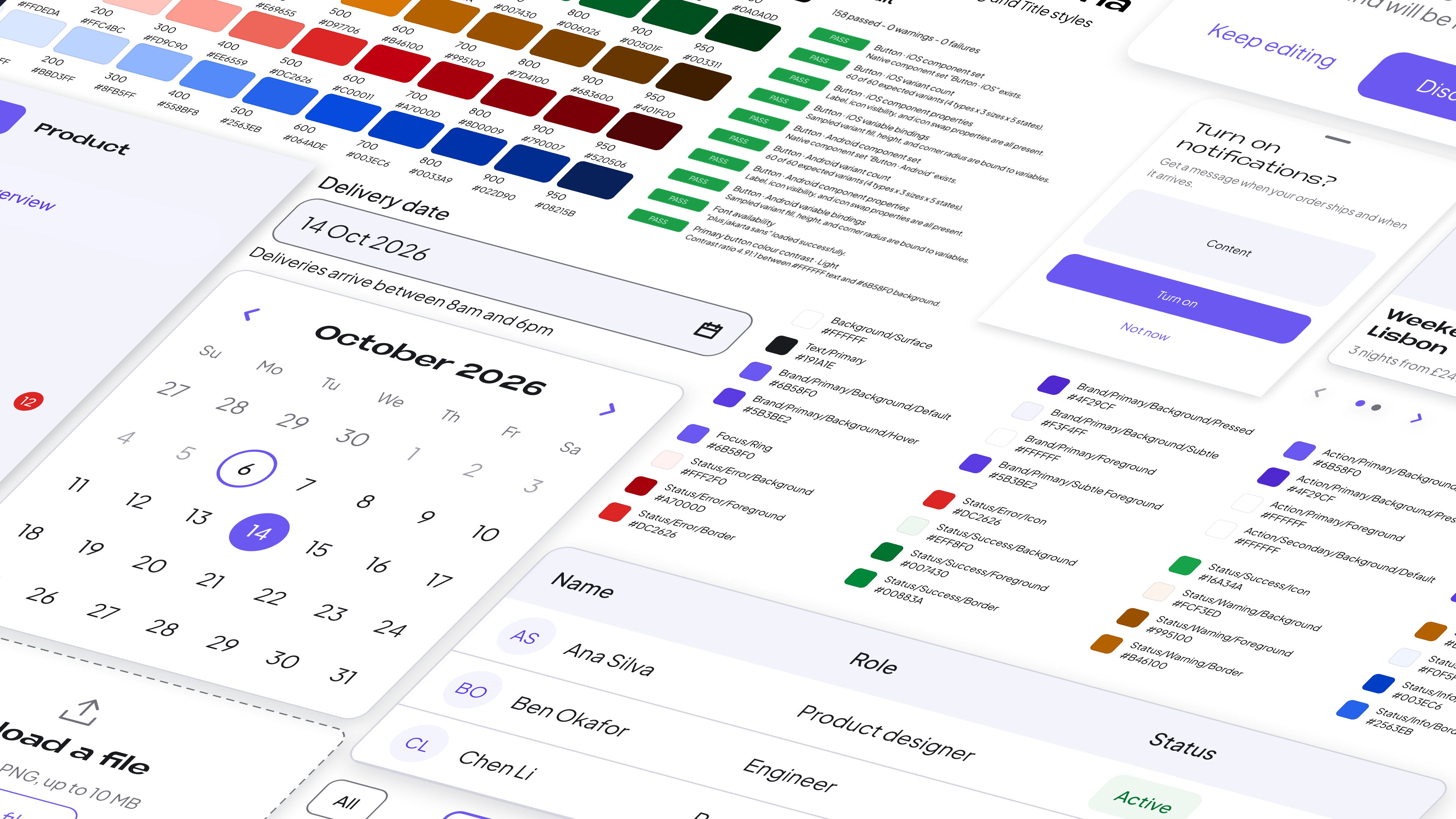
Design System Foundry is a Figma plugin that generates editable design systems for iOS and Android.
I designed and built it to provide a practical starting point, with semantic variables, reusable components, prototype interactions and accessibility checks. The generated system can be adapted and rebuilt as requirements change.
Product Scope
The Problem
Even when a product’s visual direction is established, building its design system takes substantial manual work. Designers still need to create variables, build component states, connect properties and account for differences between platforms.
I wanted to reduce that repetition without sacrificing control. The challenge was to generate a system that remained editable, coherent and useful once real product work began.
Designing the Setup
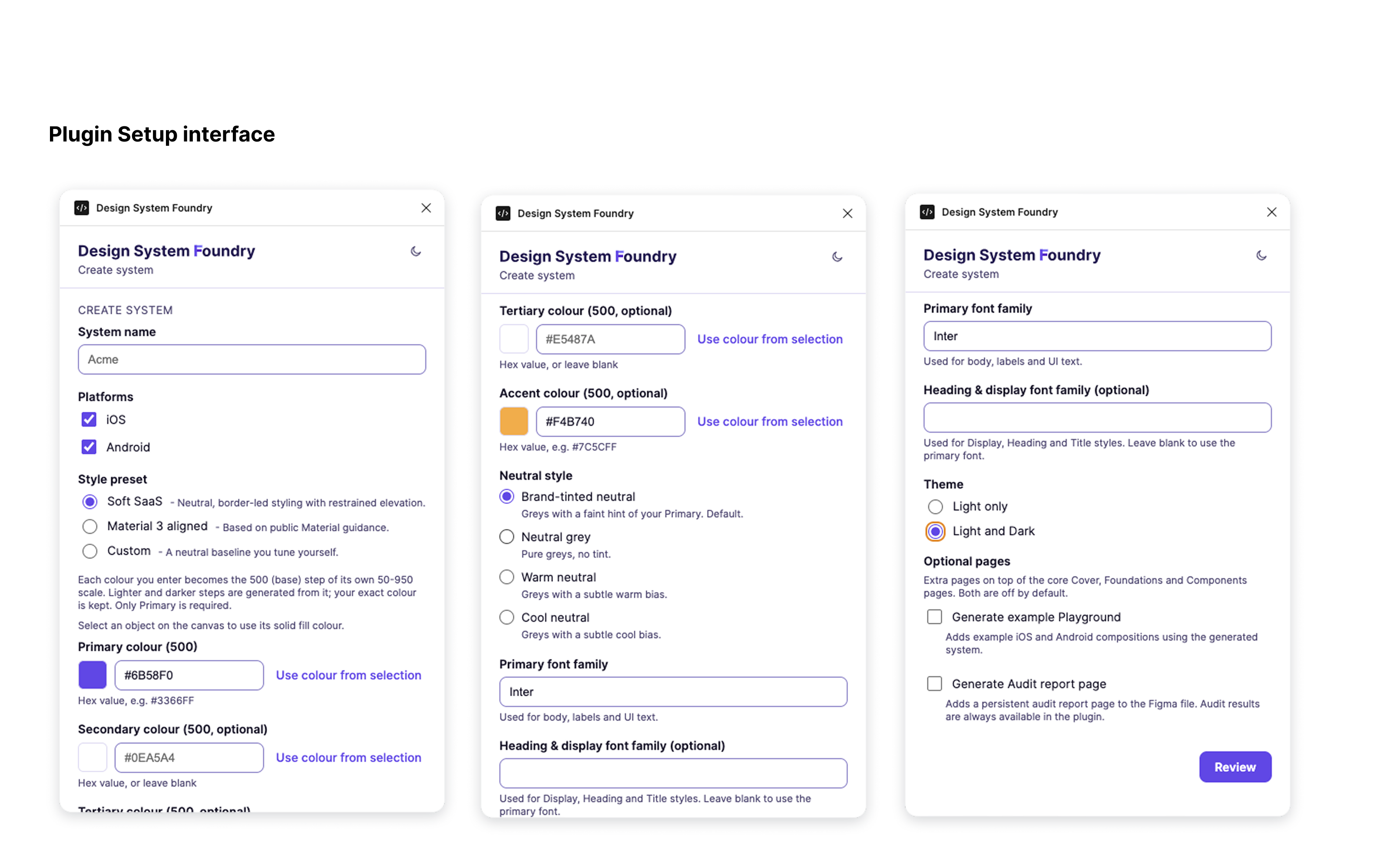
I focused the plugin on decisions a designer can make at the start: which platforms to support, the visual style, brand colours, typefaces and Light or Dark modes. Foundry turns those choices into named variables, styles and reusable Figma components.
The configuration evolved through testing. Designers can enter colours directly, use a picker or take a solid fill from a selected canvas object. Typography also expanded beyond the original single-font input to offer a separate heading and display family.
Foundations That Stay Connected
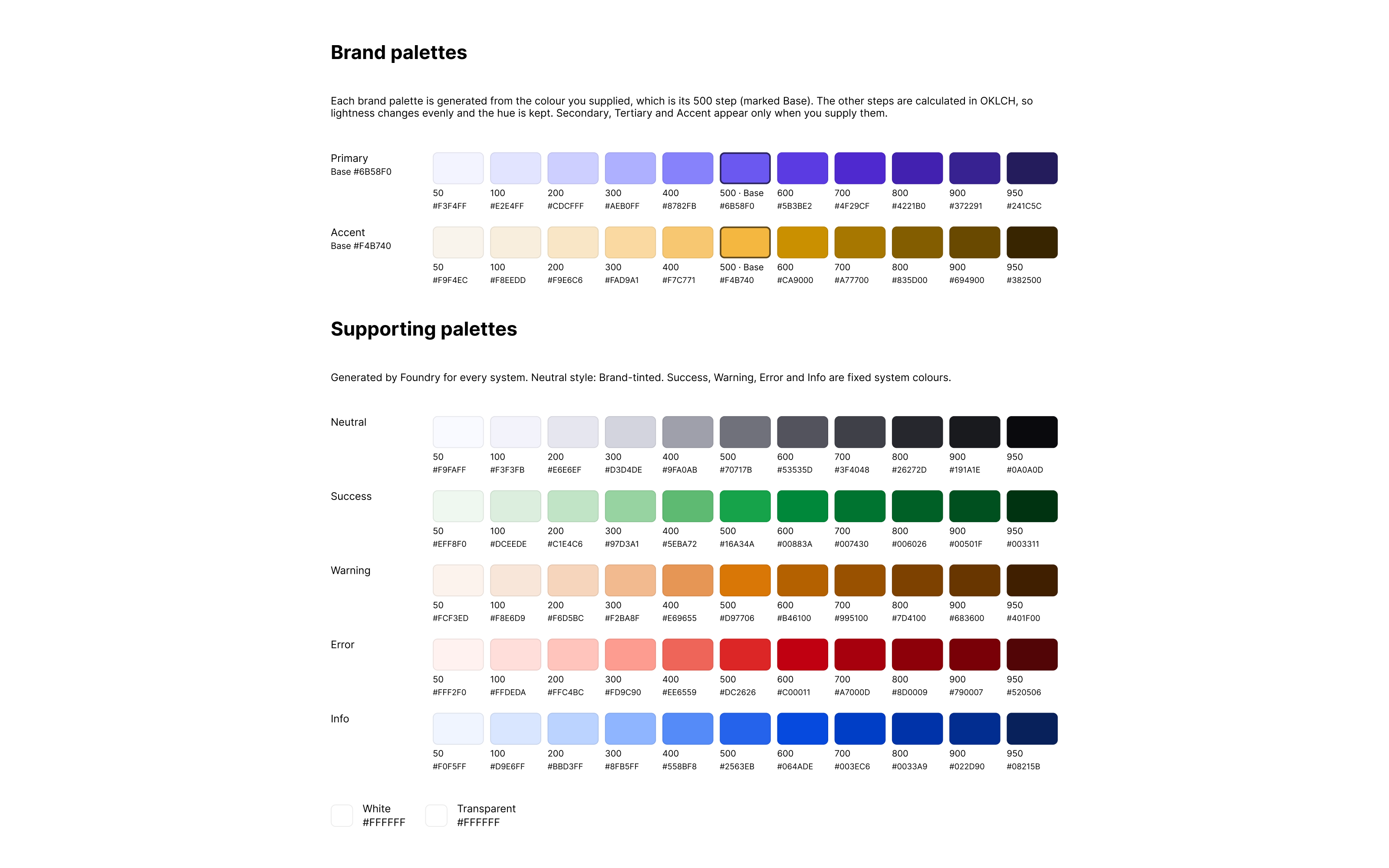
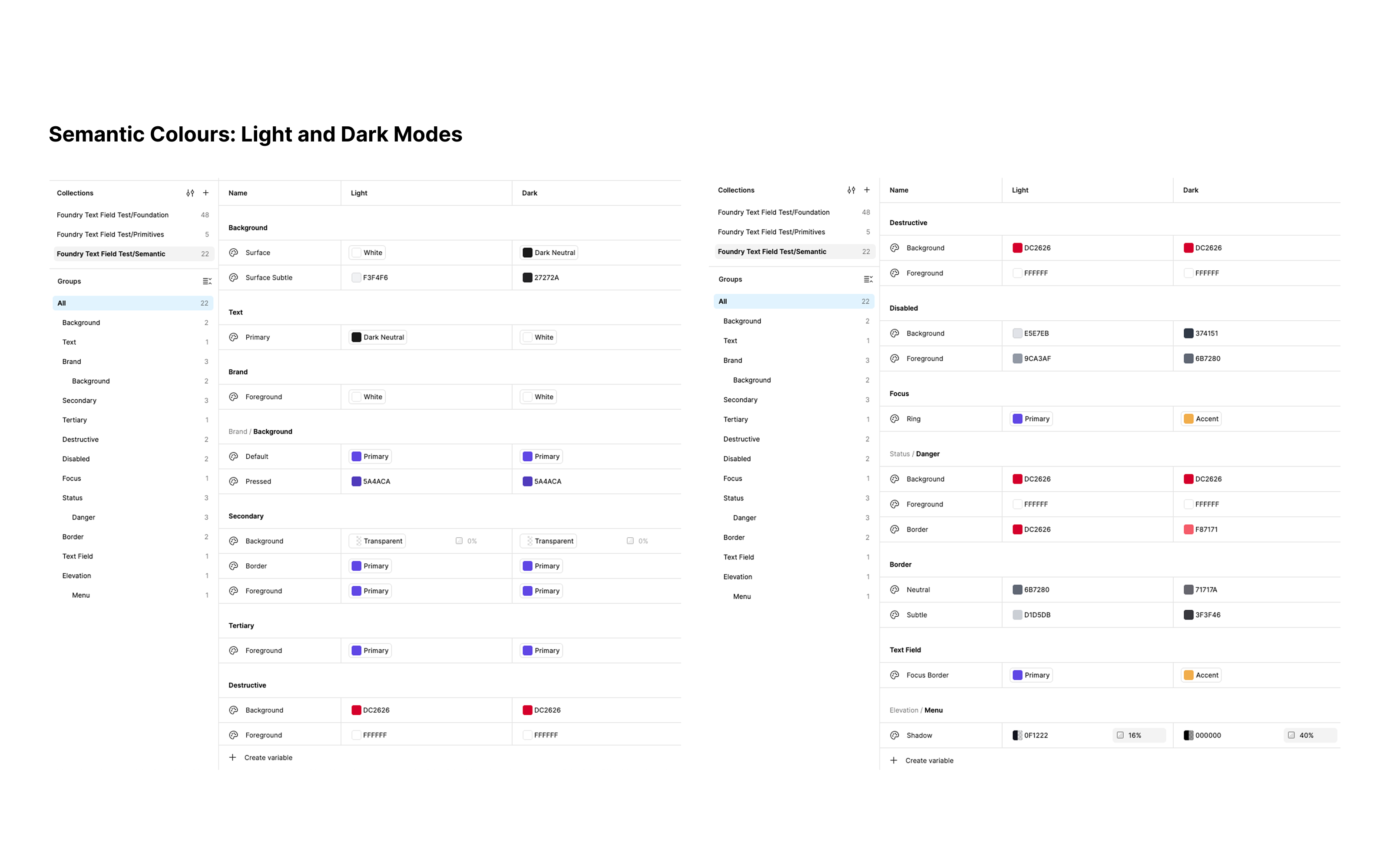
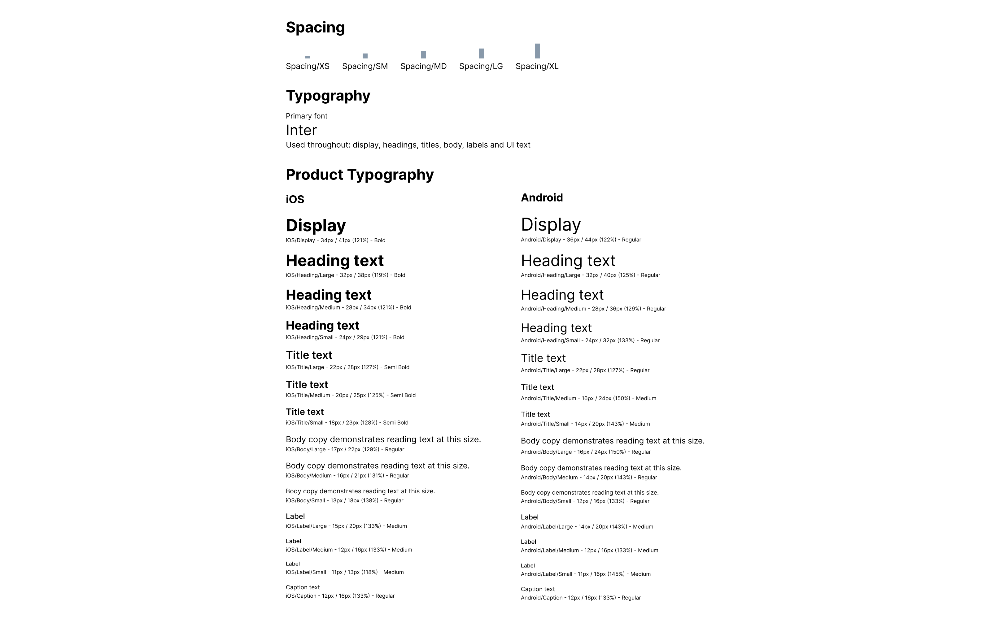
I designed the colour architecture around brand and supporting palettes, neutral and status scales, and semantic roles for component usage. Rather than hard-coding each component colour, generated assets reference Figma variables with optional Light and Dark modes.
This gives designers a starting system they can actually modify. The underlying relationships remain visible in Figma, not hidden inside the plugin.
Components With Working States
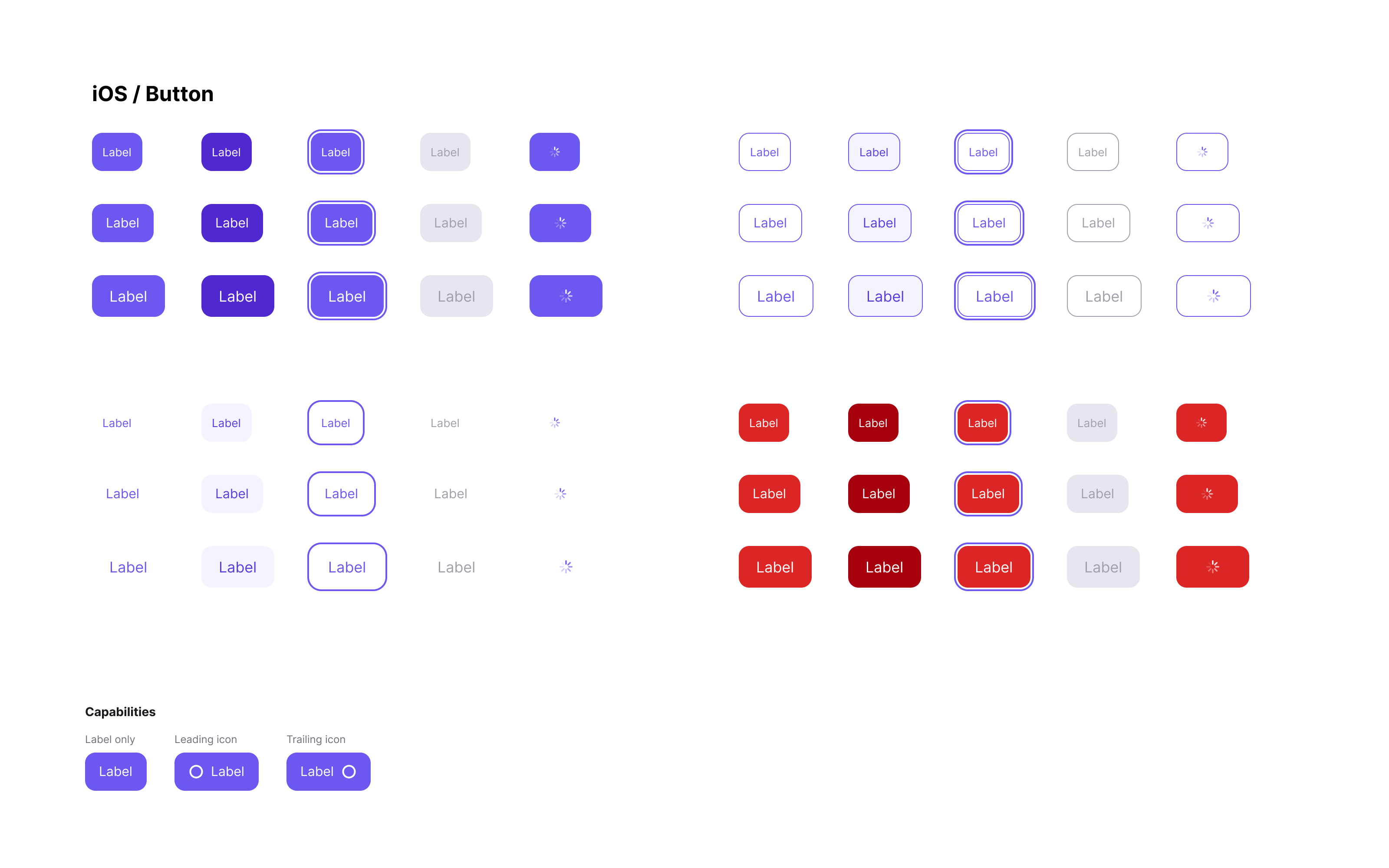
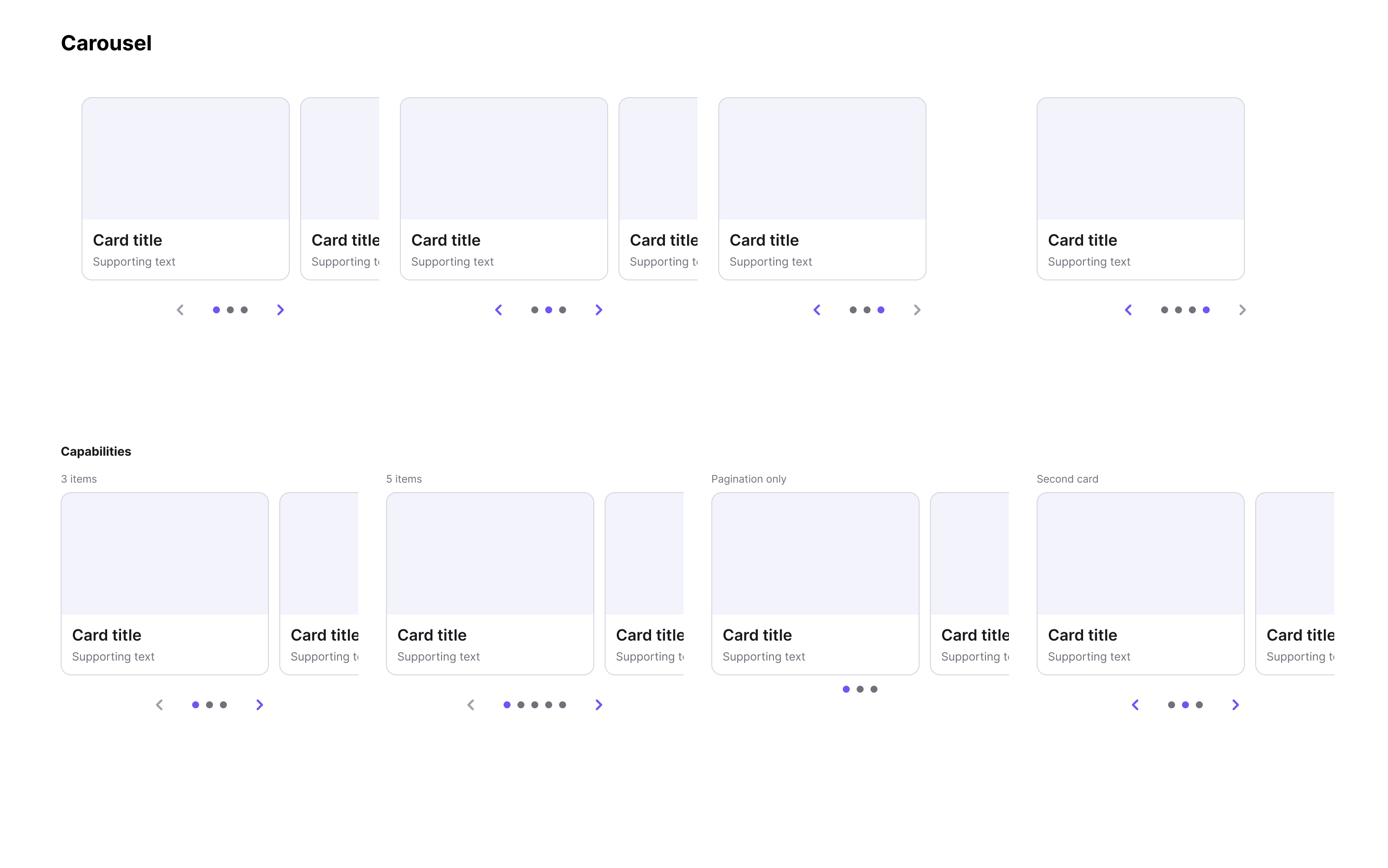
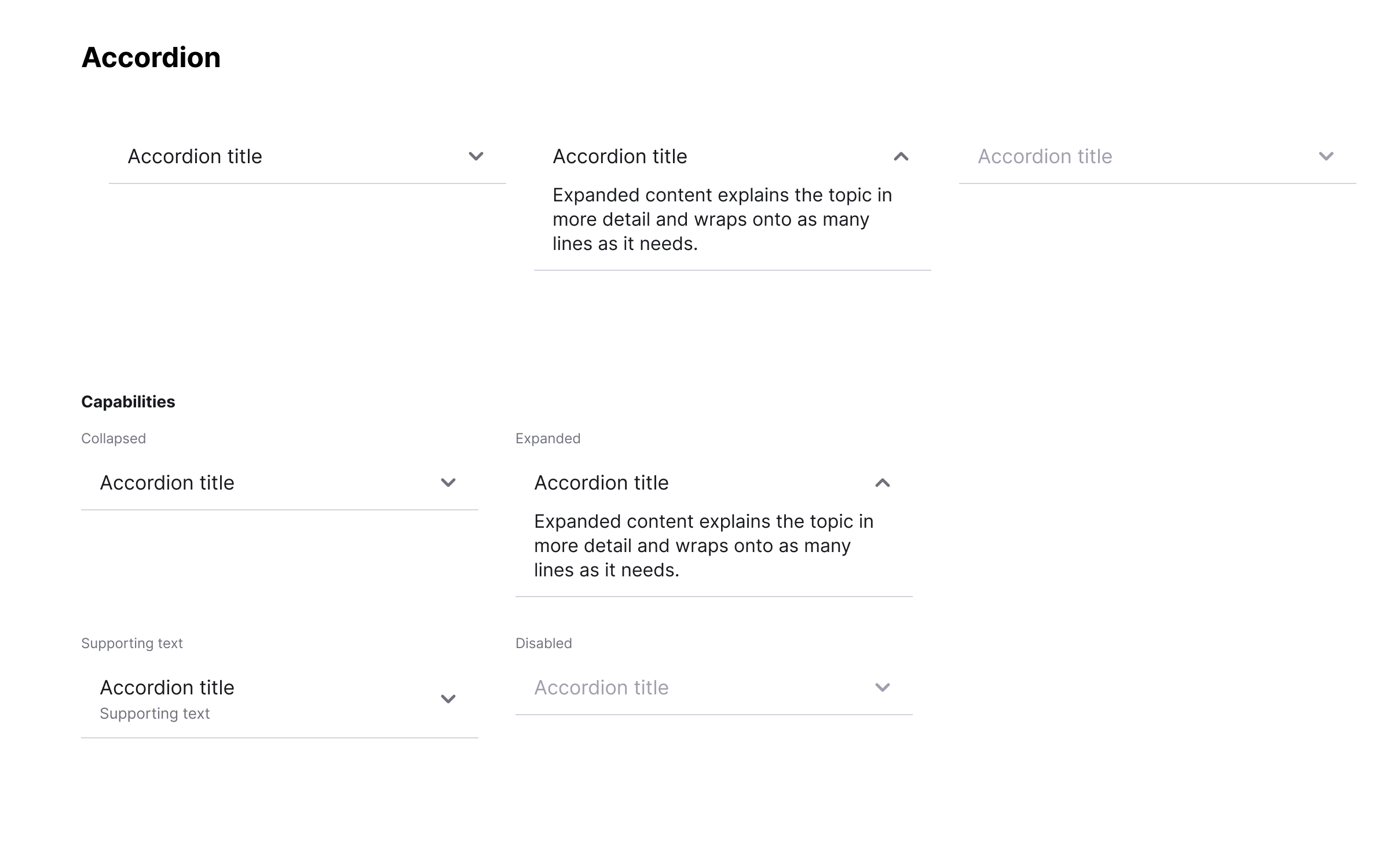
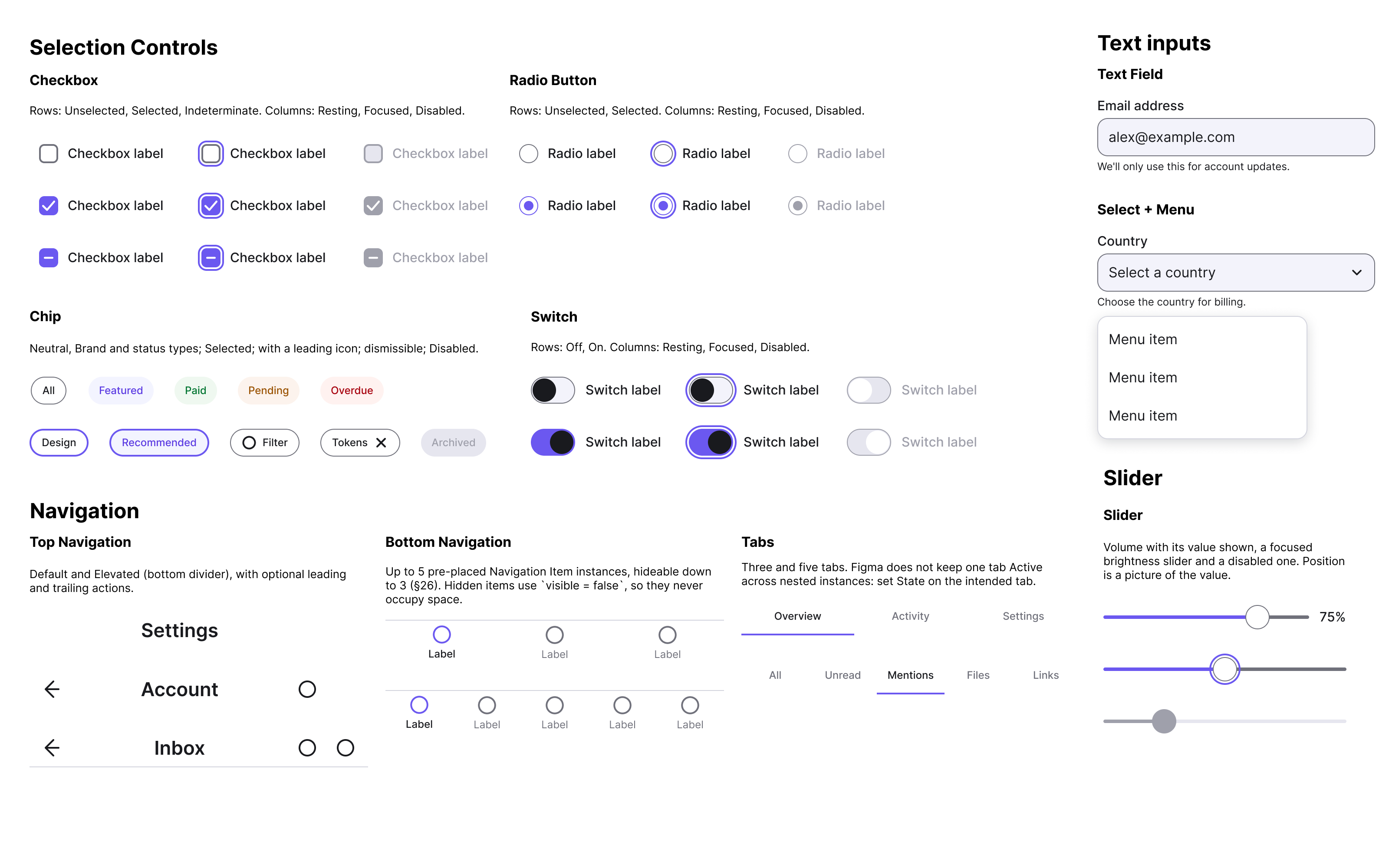
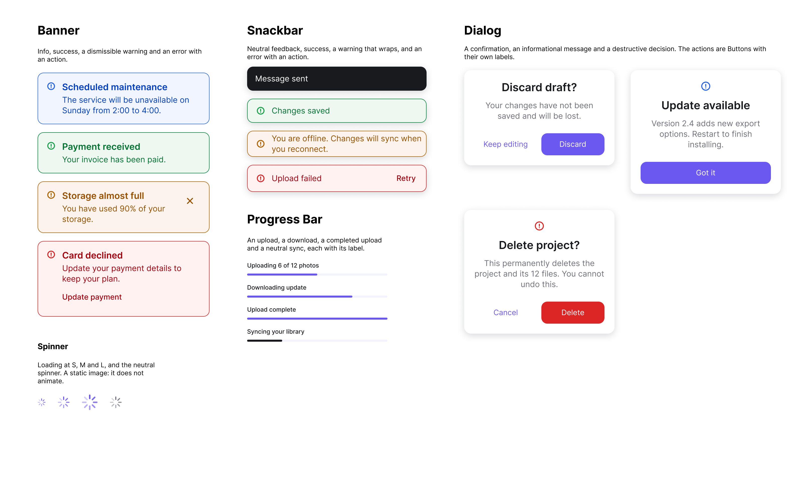
Foundry creates native Figma component sets with structured variants, instance-swap icons, editable labels and visibility properties where appropriate. Touch targets and visual treatments account for the differences between iOS and Android.
Selected components also include prototype transitions rather than only static examples: buttons demonstrate pressed states; switches and checkboxes change state; and accordions, carousels and date pickers demonstrate representative interactions. These are Figma prototype behaviours, not application logic.
Designed for Change
A useful generator needs to support the second build, not only the first. Recreating everything on every run would risk overwriting custom work or duplicating a designer’s library.
I made predictable rebuilds a core requirement. The plugin identifies the assets it generated, checks what has actually changed and preserves supported customisations instead of rebuilding everything from scratch.
During testing, rebuilds sometimes reported changes even when a component was still connected to the correct colour variable. The fix was to compare which variable was bound, rather than just the colour it displayed.
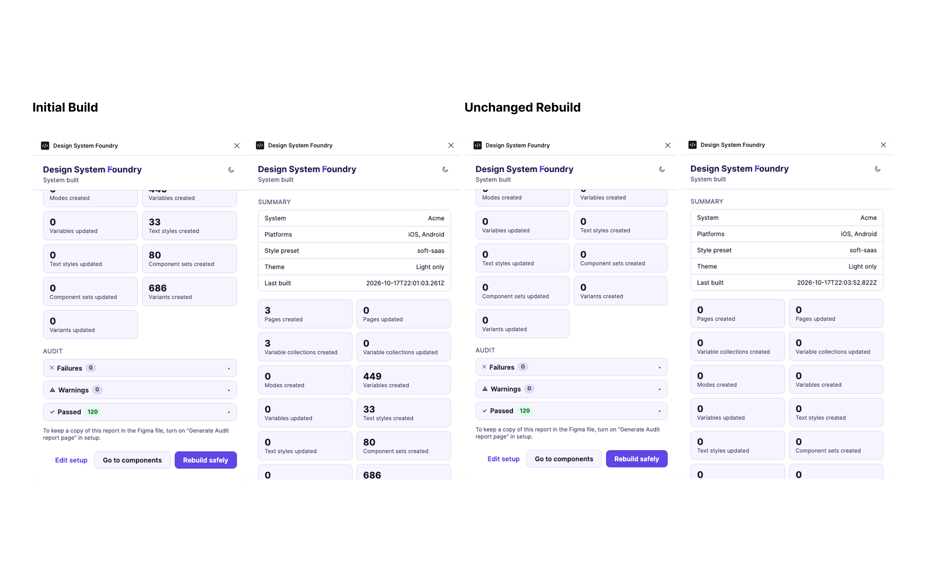
In the verified reference file, running Rebuild again without changing the setup produced zero new or updated assets.
Accessibility in the Workflow
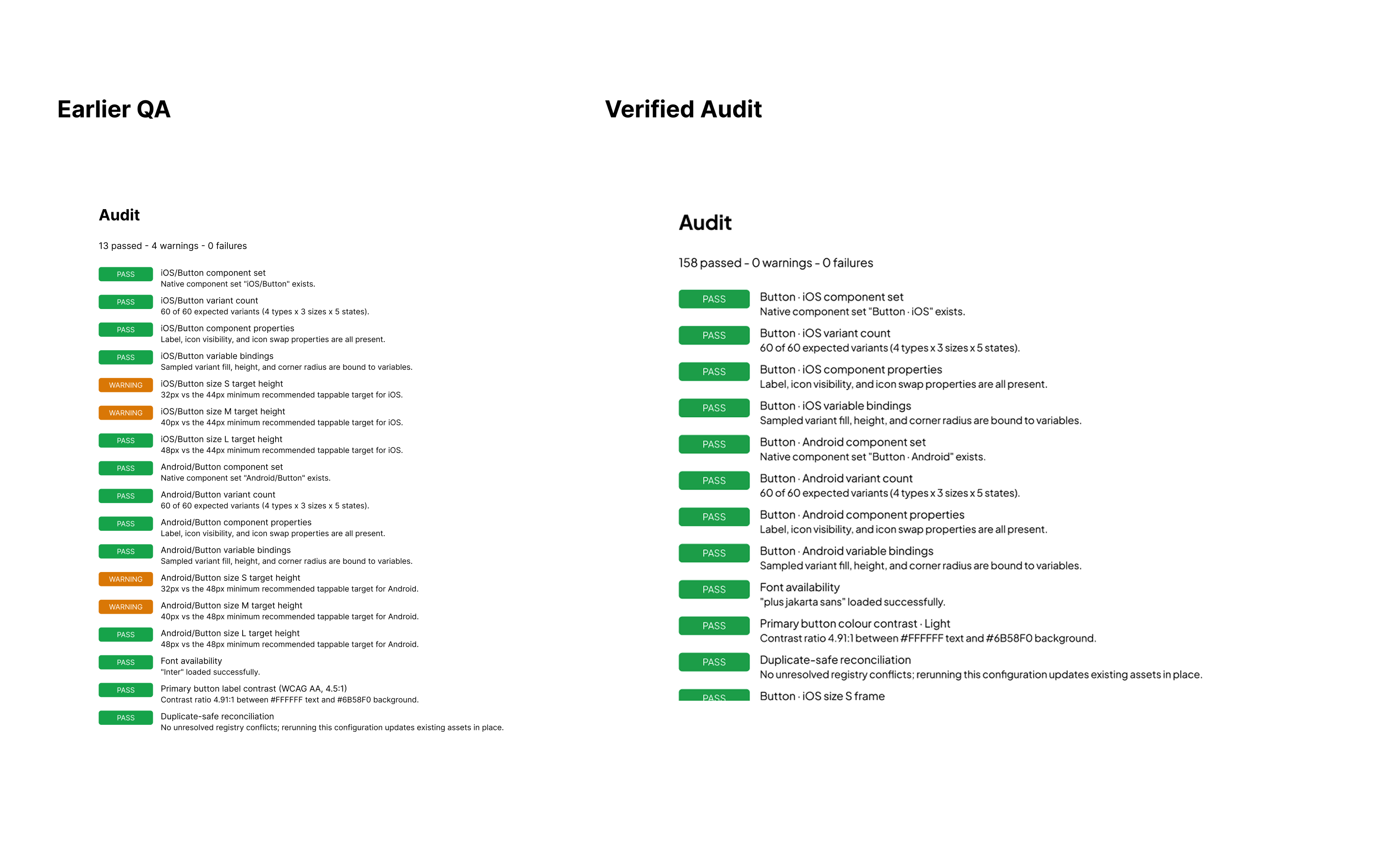
I wanted accessibility to be visible while designers build the system, rather than something checked only after the library was finished. Foundry checks relevant WCAG AA requirements, including colour contrast and touch-target sizes, and presents the results in the plugin and on a generated Audit page. During early testing, the audit identified four undersized Button touch targets across iOS and Android. These were corrected before release.
The feedback went through several revisions. I revised the audit feedback to make problems actionable: where supported, it shows the current value, the required threshold and a suggested fix. The plugin does not automatically overwrite a designer’s chosen brand colours, and suggested replacements are checked against the relevant contrast requirement.
Testing in Real Figma Files
I used Claude Code to implement the plugin, while I defined the product requirements, made the design decisions and tested the generated results in Figma. Automated tests checked expected structures and helped prevent regressions, but testing in Figma exposed problems those tests had not caught.
Examples included inconsistent spacing between controls, colours that displayed incorrectly despite having valid variable bindings, and layouts that broke for particular component configurations. I used those findings to refine requirements, verify repairs and check that existing components were not unintentionally changed.
The release candidate passed 1,256 automated tests across 80 files. That was a technical quality measure, not a substitute for testing the design experience.
AI-Assisted Development
Working with Claude Code changed how much I could implement independently, but it did not replace product judgement. The difficult decisions were about component behaviour, how changes propagate, which customisations survive a rebuild and what constitutes an acceptable result.
The process became a cycle of defining requirements, reviewing code-generated output, finding real defects and verifying fixes. AI accelerated implementation; the design direction, trade-offs and acceptance criteria still needed deliberate decisions.
Outcome / Current State
Design System Foundry v1 has been submitted to Figma Community for review. In the verified iOS and Android reference configuration, it generates 50 component families, 80 component sets and 686 variants, alongside colour variables, text styles, example documentation and accessibility checks.
The full initial build can take several minutes on older hardware. I investigated the bottlenecks before release and deferred more disruptive structural optimisation until it could be tested without putting output consistency at risk.
At the time of writing, the product had been submitted for review. I had not yet measured public adoption.
Reflection
Building Foundry reinforced that generating a design system is not the same as generating a usable one. The real design work was in the rules: how designers configure it, how components behave, how the library changes and what happens when things go wrong.
It also changed how I work with AI-assisted development: I could implement more, but I still needed to specify behaviour clearly and test the result in Figma.
